Project Summary
InstantSuretyBond.com is a digital platform designed to simplify and accelerate the process of obtaining surety bonds, which has traditionally been complex, paperwork-heavy, and time-consuming. The goal was to transform a legacy financial service into a clear, fast, and self-service online journey, allowing users to find, apply for, and receive bonds in minutes rather than days.
This project focused on reducing friction, building trust, and guiding non-expert users through a high-stakes, compliance-driven workflow.
My Role
Product Designer / UX Strategist
Responsibilities included:
• UX strategy and end-to-end experience design
• User journey mapping and workflow optimization
• Information architecture and content clarity
• Interaction design for complex, regulated flows
• Collaboration with product, engineering, and business stakeholders
The Problem
Surety bonds are required for many professions and contracts, yet most users:
• Don’t understand what a surety bond is
• Are under time pressure due to licensing or compliance deadlines
• Feel anxious about making mistakes in a regulated process
• Face slow, manual, broker-driven workflows
Key challenges:
• Complex terminology unfamiliar to first-time users
• High abandonment risk due to confusion or lack of trust
• A need to balance speed with legal accuracy and compliance
Goals & Success Criteria
Business Goals
• Apply and buy your bond in minutes
• Reduce time-to-bond issuance
• Increase completed applications
• Support high-volume, self-service transactions
User Goals
• Quickly search and identify the correct bond
• Understand what’s required without industry knowledge
• Feel confident submitting information and payment online
Success Metrics
• Reduced drop-off during application flow
• Faster completion times
• Increased conversion from “Find a Bond” to purchase
User Research & Insights
Through workflow analysis and stakeholder interviews, key insights emerged:
• Users don’t start with bond knowledge: they start with a requirement (“I need this bond to get licensed”).
• Clarity beats persuasion: users need straightforward explanations, not sales language.
• Trust signals are critical: users are sharing sensitive business and payment information.
• Speed matters most at moments of stress, especially for last-minute compliance needs.
Design Approach
1. Clarify Before You Convert
The experience was structured to:
• Help users identify the correct bond type quickly
• Explain requirements in plain language
• Reduce cognitive load at each step
Information architecture was simplified into a clear progression:
Find your bond → Apply → Review → Purchase → Receive
Find your bond → Apply → Review → Purchase → Receive
2. Design for Confidence in a Regulated Experience
Because this is a financial and legal product, the design emphasized:
• Clear labels and instructions
• Predictable steps with visible progress
• Reassurance through consistent language and layout
• Transparent pricing and expectations
Trust was reinforced through:
• Educational content embedded at decision points
• Reduced ambiguity around required information
• Clean, professional visual design
3. Reduce Friction Without Sacrificing Accuracy
The application flow was optimized to:
• Minimize unnecessary questions
• Group related inputs logically
• Prevent errors through validation and guidance
• Allow users to move quickly without feeling rushed
This balance ensured compliance while maintaining a fast, user-friendly experience
Exploration & Refinement
Search is a mission-critical capability within the application. Its interaction model was explored through multiple rounds of discovery and iterative design.
Search is a mission-critical capability within the application. Its interaction model was explored through multiple rounds of discovery and iterative design.
Process & Approach
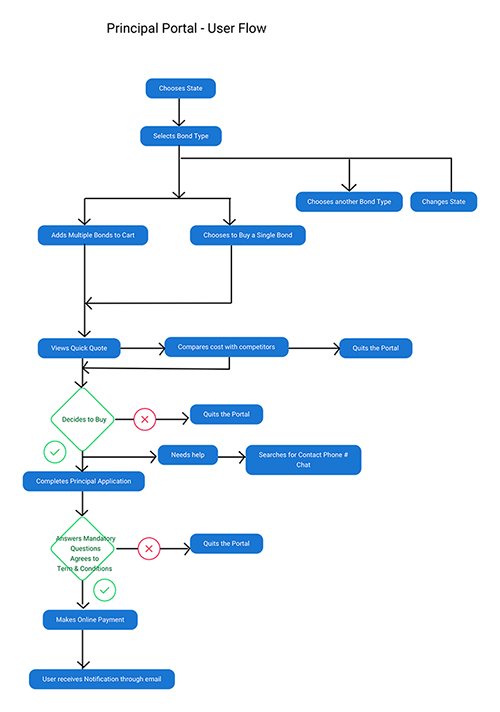
Search was a core workflow in the Instant Surety Bond experience, particularly for users who did not know the exact name of the bond they needed. The design approach focused on reducing uncertainty while supporting multiple paths to discovery.
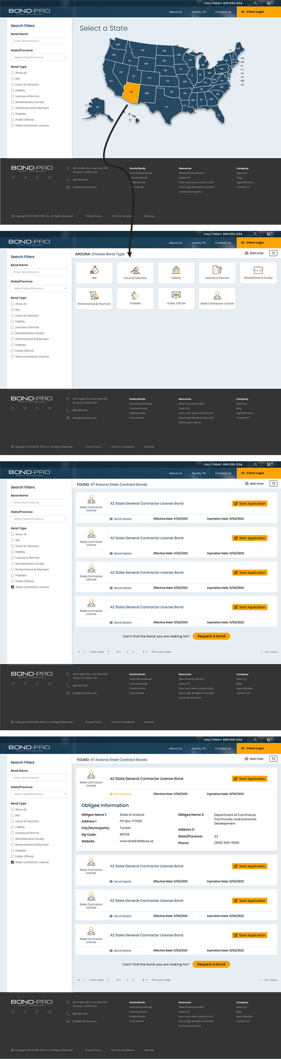
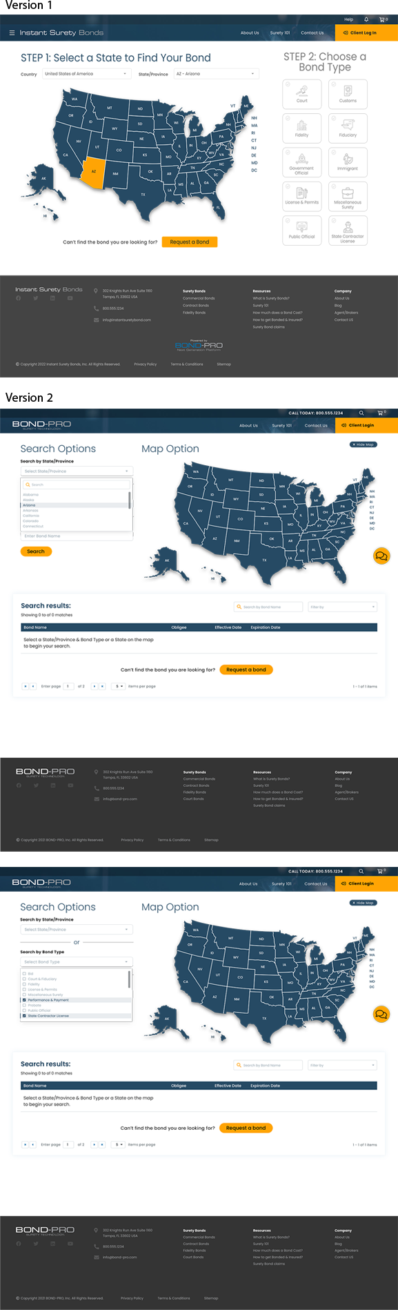
The initial exploration paired an advanced search panel with a map, allowing users to visually select a state or jurisdiction. Research insights indicated that users were comfortable using a map and found it helpful for anchoring their search geographically.
A second exploration introduced a guided, step-based flow, prompting users to select a state or jurisdiction first, followed by a bond type. While this added clarity, it limited flexibility for users who preferred to browse.
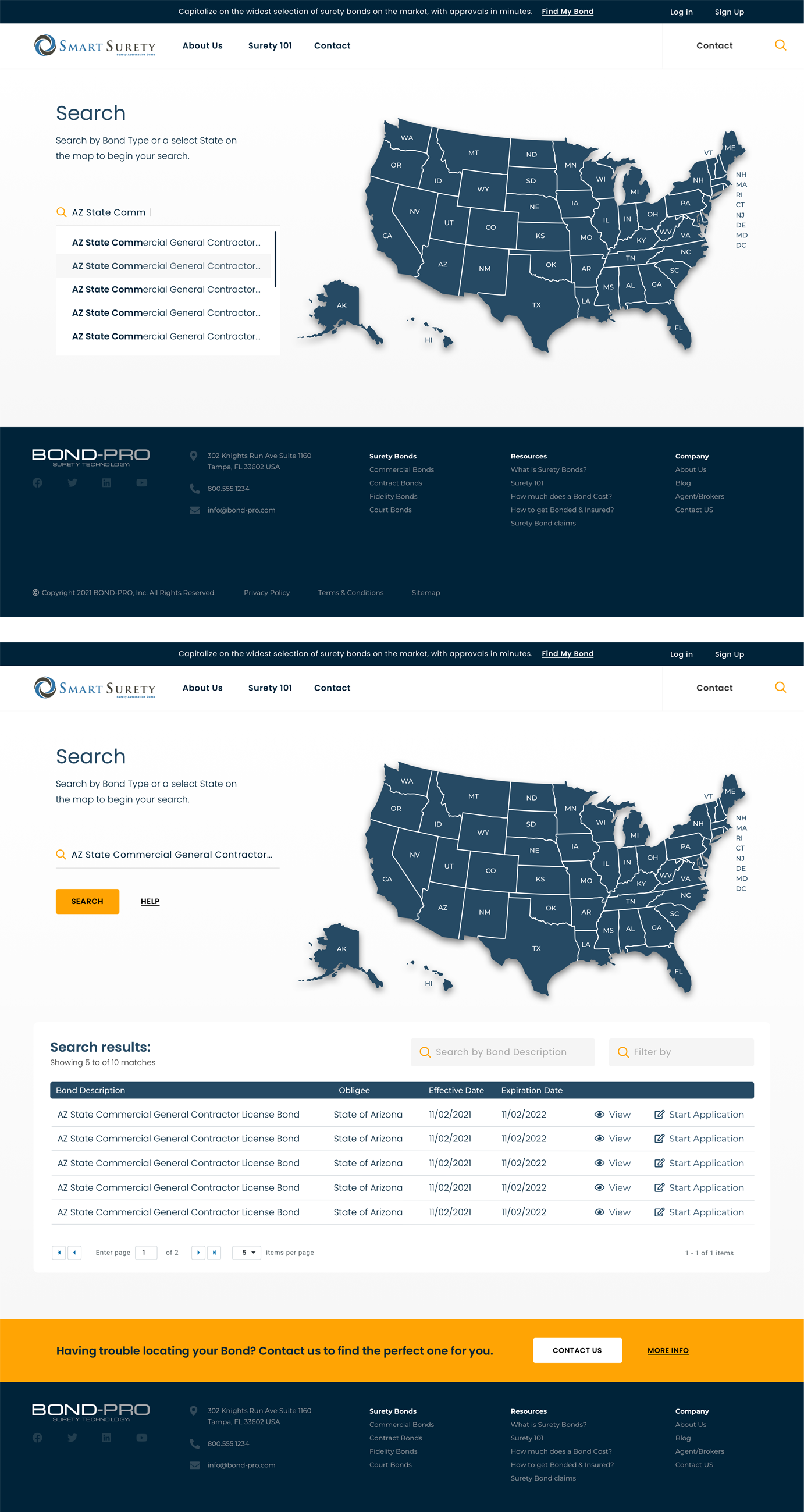
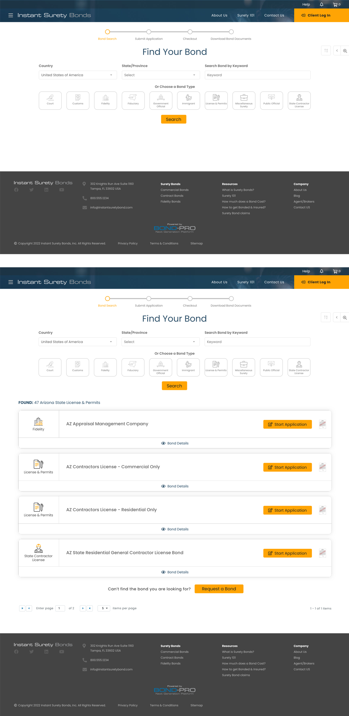
Subsequent iterations combined both approaches into a hybrid model. Users could browse bonds by state using a map or dropdown, then refine results by bond type. Later explorations further simplified entry points by offering keyword search alongside geographic browsing, and tested icon-based alternatives to the map to support faster visual scanning.
Why This Approach
The final direction balanced guidance with flexibility, supporting users with varying levels of familiarity. Multiple entry points—keyword search, geographic selection, and category browsing—helped minimize friction while maintaining clarity in a complex, task-oriented experience.
Through several design iterations and usability testing, this search UI proved to be the most effective approach. The interface is intentionally simple, clear, and compact. Since a primary product may include dozens or hundreds of sub-products, flattening the structure streamlines results into a single, scannable row.
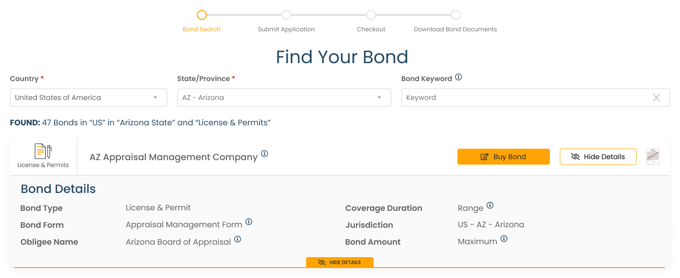
Key Design Solutions
• Guided Bond Discovery: Users are helped to identify the correct bond rather than searching blindly.
• Plain-Language Content: Legal and industry terms are explained simply and contextually.
• Streamlined Application Flow: Reduced steps and clearer input requirements.
• Immediate Digital Fulfillment: Bonds are delivered quickly once approved, reinforcing the platform’s value proposition.
Outcome & Impact
While exact metrics are proprietary, the redesigned experience contributed to:
• Faster completion times
• Reduced user confusion and support dependency
• Higher confidence at checkout
• A scalable, repeatable digital workflow for a traditionally manual service
The platform successfully demonstrates how complex financial products can be delivered through a modern, human-centered digital experience.
Key Learnings
• Designing for regulated industries requires clarity, trust, and restraint
• Speed is only valuable when users feel confident and informed
• UX plays a critical role in translating legal requirements into usable experiences
• Removing friction doesn’t mean removing guidance; it means designing it better