Project Overview
The BP Rules Management System was redesigned to improve how business users manage complex rules logic within a corporate application. The goal was to create a more intuitive, efficient, and scalable interface for high-volume rule creation and maintenance.
The BP Rules Management System was redesigned to improve how business users manage complex rules logic within a corporate application. The goal was to create a more intuitive, efficient, and scalable interface for high-volume rule creation and maintenance.
The Challenge
The existing rules management interface was inefficient and hard to use:
• Users struggled with creating, editing, and validating rules
• Complex logic was difficult to visualize
• Poor workflows resulted in high error rates and long task times
Goal:
Design an intuitive, user-friendly interface that supports:
Design an intuitive, user-friendly interface that supports:
• Clear visualization of rules logic
• Efficient rule creation and editing
• Scalable workflows for power users and administrators
Problem & Opportunity
Before this project, rule management within the BP platform was:
• Confusing to navigate — users struggled to find rules relevant to their domain,
• Difficult to maintain — editing and versioning were not intuitive,
• and error-prone — lack of clear feedback and structure caused costly mistakes.
These issues led to inefficiencies, frustration among users, and increased support tickets. The opportunity was to simplify the experience, reduce cognitive load, and make rule management a more predictable and productive task.
Design Process
User Research & Discovery
To begin, I engaged with key users and stakeholders to gather contextual insights:
• Conducted interviews and contextual inquiries to understand workflows and pain points
• Synthesized findings into key user needs and problem areas
• Defined user personas and primary goals for rule management tasks
These activities helped shape the core problem statement: Users need a more intuitive, navigable, and error-resistant way to manage business rules that scales to BP’s complex rule environment.
Ideation & Wireframing
I then moved to ideation:
• Sketched multiple layout and interaction concepts
• Developed mid-fidelity wireframes to explore the information architecture of rule categories and editing functions
• Focused on clarity, structure, and minimizing clicks for frequent tasks
Prototyping & Iteration
Next, I built interactive prototypes to test assumptions:
• Created Figma prototypes showcasing key workflows (rule search, edit, save)
• Conducted informal usability tests with stakeholders and internal users
• Iterated based on feedback to refine interaction sequences and messaging
For example, early validation revealed users needed clearer feedback when saving changes - so visual confirmation and inline guidance were added in later versions.
Initial mock showing placement of elements and properties.
Outcome & Impact
The redesigned UX for BP Rules Management produced several measurable improvements:
• Improved Discoverability: Users can now find and filter rules more efficiently
• Reduced Errors: Enhanced feedback and guidance lowered the frequency of incorrect rule edits
• Stakeholder Satisfaction: Engineering partners noted the design was realistic from a development perspective and reduced rework
This project bolstered internal confidence in UX-driven improvements and demonstrated a collaborative, data-informed approach to solving complex system challenges.
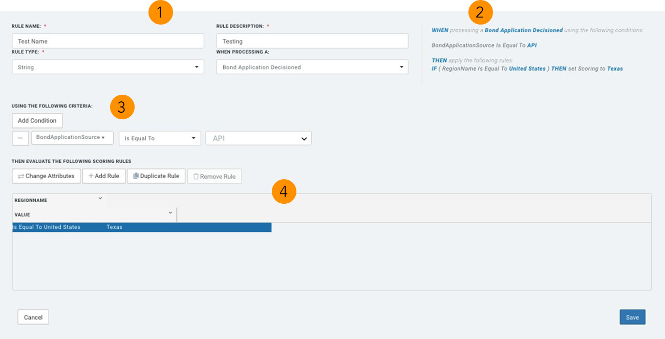
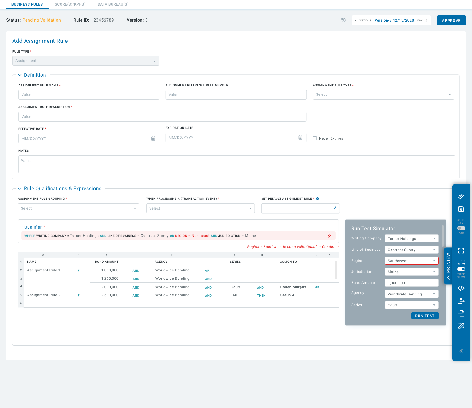
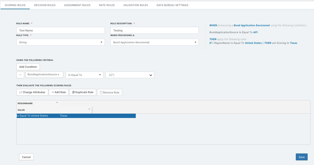
1. Ensured proper labeling of sections. Implemented UX patterns as part of enterprise global standards i.e. accordions and cards.
2. Showed logic/validation when the User initiates the “Run/Test” button. This simplifies the UI so that the User can focus on setting Rule Qualifications and Expressions.
3. Implemented Qualifers confirming criteria are properly identified. Tree logic are nested and labelled “WHEN/IF/THEN” with buttons grouped in their respective areas resulting in an intuitive UI.
4. “IF/THEN” conditions were then sub-grouped to show the User the end results when the rule passed all criteria and conditions.
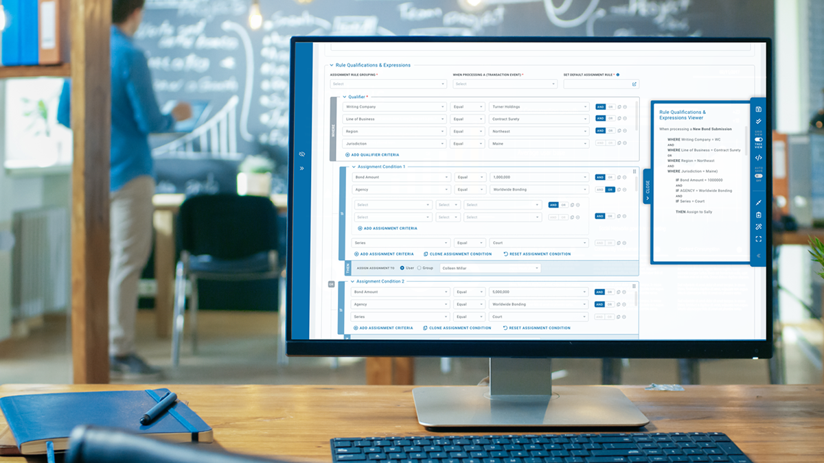
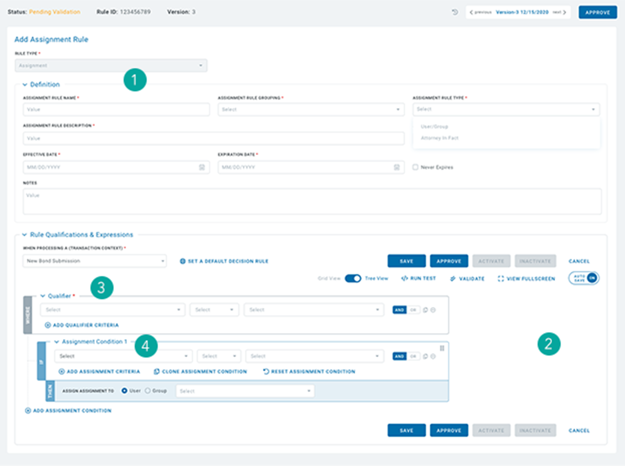
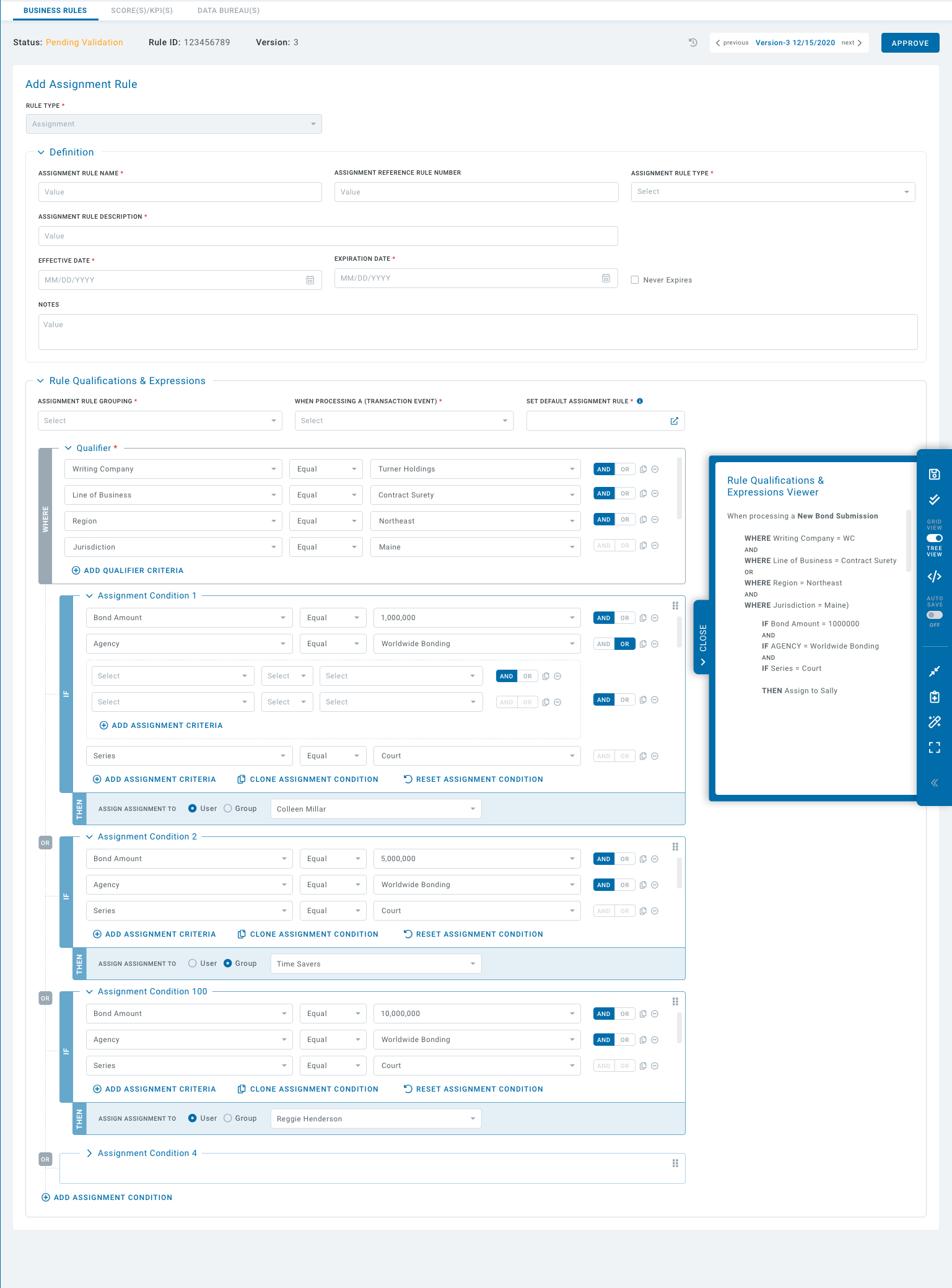
A Rule can potentially have tens or hundreds of Conditions. In such a scenario, the “Save, Approve, Run Test, Validate” buttons, initially located at the top and bottom of the Qualifier area, would be difficult to access. Users would have to scroll all the way to the top or bottom to gain access. To solve this problem, a floating toolbar was implemented. The User now has access to all buttons, validation and testing, and logic expressions.
Final Prototype – default view showing floating expandable menu with Qualification & Expression Viewer.
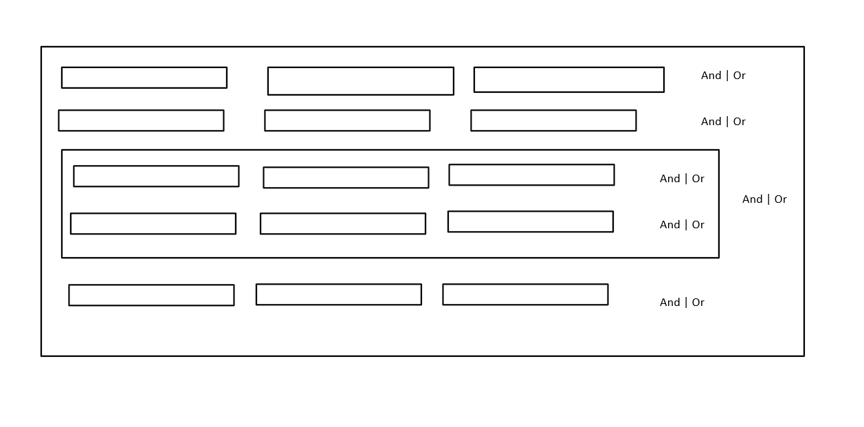
Final Prototype – grid view showing rule test simulator.
Users can toggle between Tree View and Grid View. The Grid View is a compressed view of all Conditions and Criteria including the logic “IF/THEN/OR”. This is a user-friendly view if there are tens or hundreds of Conditions and Criteria in a rule.